I only picked up this book as light reading whilst eating my breakfast. It didn't occur to me that it may be useful! Flicking through the pages, there are some fascinating images and some that I knew instantly as iconic photographs. It wasn't until seeing Lewis Hine's image (Pg. 16), that his series on Child Labour came flooding back to me. I don't know how I hadn't thought about him earlier! He is one of my photographic inspirations and it never occurred to me that his projects will link in with what I am researching.

©Lewis Hine
"Sadie Pfeifer, 48 inches high. Has worked half a year. One of the many small children at work in Lancaster Cotton Mills. Lancaster, S. C., Nov. 30, 1908."
The large machinery surrounding the small child shows just how vulnerable she is and that industry isn't a place for young children. If I saw this as part of a campaign, it would anger me that such labour exists. Hine is able to engage his viewers and make them feel a range of emotions. Additional power lives behind the photographs because he has experience in the situations he captures; working in an upholstery factory, 13 hours a day, 6 days a week. Being able to live through the individual in your images, gives more of an impact because your image portrays the situation with more realism, you can really get in to how the girl is feeling and what the conditions are like. What would the images look like if Hine was simply an outsider? Being able to relate to the experiences, gives a personal touch.
Hine uses the photographic medium to 'educate' people. I hadn't considered looking at it this way and I really like this terminology to describe using images to make people aware of issues. He also gave lectures on the topics close to him, further educating people with the back-up of words alongside his images. Organising people to come and give talks during my campaign to highlight the issues I am raising, is something I need to look in to. It is a great idea to have more than one platform of communication.
Page 48 made me come into contact again with a photograph I have seen and studied many times over the past 4 years. I don't know many people who haven't seen this image before (may be because most of the people I know are photography related?).

© Dorothea Lange
Migrant Mother, March 1936, Nipomo, California
In my opinion, how Lange has framed the image changes the impact. Would your view and feelings change if you could see the tent they lived in at the Pea-pickers camp? Would it make you 'pity' them more?
The black and white works well for this particular image and the message being portrayed. You aren't being distracted by the colour palette, the context and the subjects are focused on. This is what I believe, others disagree and say that you need the colour to show the realism. In a lot of cases, I wouldn't argue this, but in this instance, I stick to the success of black and white imagery.
One of the things I admire about Lange's Migrant Mother image, is the ability to provoke feelings within the viewer without the need to shock and disgust them. The image isn't of a positive scene, so you can see suffering, but it isn't making you feel guilty. You are empathising instead, feeling sorry for the lady and children present. Seeing the two children buried into the shoulders of this thoughtful looking woman, tugs at my heart-strings.
In the book, there is an article accompanying the photograph, highlighting and informing the reader about the situation the image derives from. With a photograph like this (if being used for campaigning or raising awareness), needs the additional information sitting next to it. There is power within what you can see, but being knowledgable on the situation gives the image more of an impact. The paragraph simply emphasises what you are viewing.
On the subject of books, Lange's series of images were made in to a book. This targets a completely different audience and is another way to get the surrounding issues raised. The photographer is no longer commercial, they become a social documentarist; bringing the Artistic world in to the equation. So, as well as targeting people who you want to donate, raise awareness too and make a difference, you are reaching out to those who are artists/photographers and art sector enthusiasts. I know many people who love photographs similar to Lange's and have created a collection of books full of social documentary images. These people aren't interested necessarily in the cause or the 3rd sector, they are interested in the photographs themselves. They are still contributing to the cause by purchasing a book, but not through deliberately donating.
As a photographer, you always want to appeal to the Art sector and get their interest on your side. I know this is the case with me. A book is something I have been certain on from the beginning. My images will be collected up and presented in a printed publication aimed towards the Art market. A booklet will be produced alongside the book, which can be handed out to everybody. The book will be an Art piece to be produced and purchased on request.
Just image owning a limited edition of a book which includes a series of photos from one specific photographer that 'changed the world', and knowing that by purchasing the book, you contributed by funding the organisation helping the cause.
"Photographs were important tools in convincing legislators to aid poverty-stricken Americans" (Pg. 48)
The sentence above backs up my view on how important imagery is in getting the attention of the public. In fact, I believe the are vital. You can't look anywhere without seeing images (moving/still). When using them to campaign, you aren't simply targeting the public to make them aware and to hope they will help with donations and volunteering, you aim to grab the attention of individuals higher up on the scale who can make the massive differences. This is where I am going to open up my campaign/event to local (or international if necessary) people who I consider to be important and possible beneficiaries to my cause.
The article on Page 100 in this instance, is not what I am interested in, it is purely the picture. The reason Diane Arbus took this image, doesn't have any connection to what I would use it for. The only part of the article of interest is when the interaction is commented on between the subject and the photographer. Her images always connect the two sides together so the viewer really feels the scene and can look in to the subjects eyes. I like this approach because I feel it would work within campaigning; not the 'look in to my eyes and feel guilty' but the 'look in to my eyes and see how you helping me is making my life positive'. In this image, what is the little boy trying to communicate to the photographer/viewer? Copying the anger he sees in others? Anger at others? Frustration at the life surrounding him? Is he pretending?

The article on Page 100 in this instance, is not what I am interested in, it is purely the picture. The reason Diane Arbus took this image, doesn't have any connection to what I would use it for. The only part of the article of interest is when the interaction is commented on between the subject and the photographer. Her images always connect the two sides together so the viewer really feels the scene and can look in to the subjects eyes. I like this approach because I feel it would work within campaigning; not the 'look in to my eyes and feel guilty' but the 'look in to my eyes and see how you helping me is making my life positive'. In this image, what is the little boy trying to communicate to the photographer/viewer? Copying the anger he sees in others? Anger at others? Frustration at the life surrounding him? Is he pretending?

© Diane Arbus
Boy with toy hand grenade, 1962, Central Park, New York City
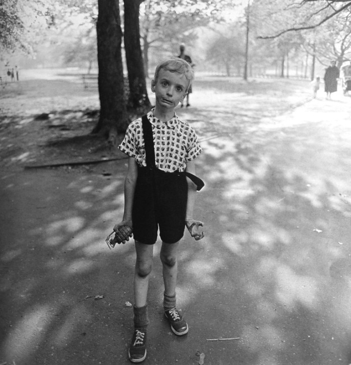
If you saw this image and knew it was part of a raising awareness campaign, what would you think the message was? War children? Dangerous weapons? Violence? How well are you protecting your children? Young fighting in war?
Again, this photograph is black and white like the Migrant Mother, but in this particular scene, the image in my opinion would be much more effective in colour, as it would highlight the grenade the boy has in his hand. Unless you read the image title, you wouldn't know that it is only a toy. The realism of weapons is being drained from the image without colour being present. I want to see the weapon, his dirty knees, the colour of his shoes and the greenery surrounding him. The beauty of a playful child and beautiful surrounding, contrasted with a dangerous weapon that shouldn't be part of the scene.
No comments:
Post a Comment